
Operating System
Dull spreadsheets and endless rows of numbers won’t impress stakeholders. These 10 creative financial data visualization techniques transform complex data into compelling stories that drive engagement and trust—perfect for executives, investors, or team presentations.
Interactive Dashboard with Real-Time Updates
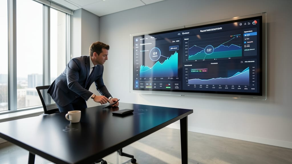
Tired of static slides that leave stakeholders asking, "But what about Q3?" after your presentation? An interactive dashboard built in Power BI or Tableau turns financial data into a live exploration tool—perfect for meetings where questions pivot faster than your slides can load.
With real-time updates and drag-and-drop filters, stakeholders drill into revenue trends, expense breakdowns, or KPIs without waiting for follow-up reports. Tools like Power BI’s AI-driven insights or Tableau’s natural language queries let non-technical users ask questions like "Show me 2023 vs. 2024 by region" in seconds. The touchscreen-friendly design ensures smooth interactions, even when someone interrupts with a last-minute "What if we exclude Q1?"
This approach shines for executive reviews, investor updates, or live boardroom discussions where agility matters more than polished slides. No more awkward pauses—just dynamic data that adapts to the conversation. ✨
Infographic Timeline of Financial Growth
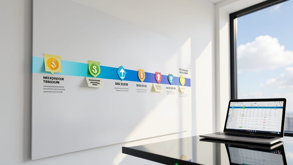
Tired of burying your company’s growth story in dense spreadsheets? An infographic timeline turns financial milestones into a visual journey that investors and executives remember—not just glance at.
Use tools like Canva or Piktochart to layer icon-based markers for funding rounds, revenue spikes, or market expansions against a sleek timeline. Add gradient backgrounds and high-contrast typography to highlight key metrics (e.g., "$5M Series B" in bold). For deeper impact, embed interactive PDFs with hover details—no coding required.
This approach shines in annual reports or pitch decks, where storytelling matters more than raw numbers. Perfect for startups or established brands needing to simplify complex narratives. ✨
3D Financial Model Animations

When venture capitalists ask, "Show me the money!"—literally—3D financial model animations turn static spreadsheets into cinematic storytelling. Tools like Blender (free) or Cinema 4D let you animate cash flow projections, burn rates, and revenue funnels with smooth transitions, color-coded highlights, and even interactive elements for live pitches.
Start by modeling your data in Excel or Google Sheets, then import it into Blender using Python scripts or plugins like Sheet2Blender. Add keyframe animations to show growth over time—watch those bar graphs rise like skyscrapers or watch cash reserves shrink dramatically during downturns. For polish, overlay realistic textures (e.g., glass for transparency, metal for tech startups) and sync animations to a narrative voiceover for maximum impact.
This technique is a game-changer for startups or scale-ups pitching to VCs, where visual storytelling can make the difference between a "maybe" and a "let’s fund this". 💡
Storytelling with Data Comics

When your audience glazes over at spreadsheets, data comics turn financial concepts into engaging narratives—like a superhero origin story for your balance sheet. Tools like Canva’s comic templates or Piktochart let you embed charts, callouts, and even animated transitions to guide viewers through data-driven decisions without jargon overload.
Start with a character-driven scenario (e.g., "Meet Dave, our customer acquisition hero") and sprinkle in key metrics via speech bubbles or thought clouds. For example, a revenue growth panel might show Dave’s journey from $50K to $200K with icons for milestones and bolded numbers for impact. The zero-learning-curve design makes it perfect for training sessions where retention is key.
Trainers and onboarding teams will love this for breaking down budgets or ROI calculations—non-technical stakeholders grasp complex ideas faster when wrapped in a familiar comic format. 💡
Geospatial Heatmaps for Market Analysis
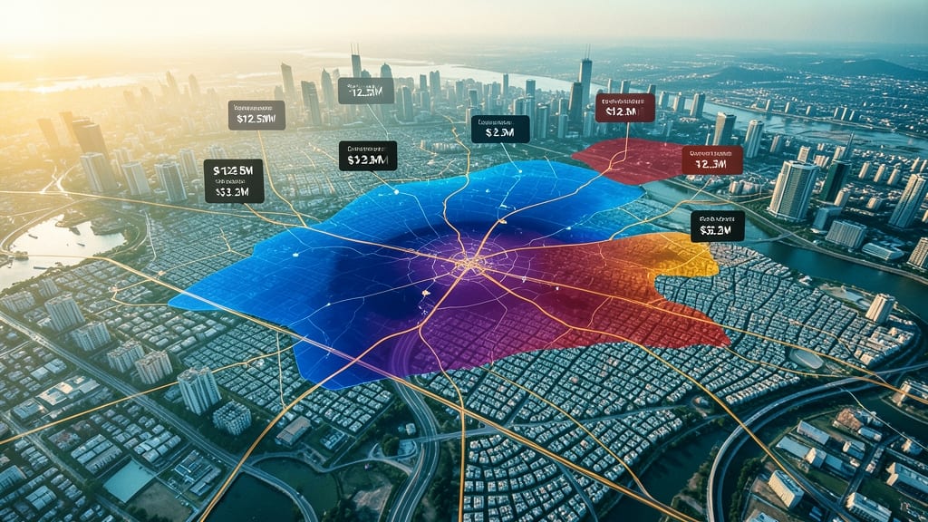
When your financial data feels disconnected from real-world decisions, geospatial heatmaps turn abstract numbers into actionable location insights. Tools like ArcGIS Pro or Google Earth Engine overlay revenue density, customer foot traffic, or logistics costs onto interactive maps, revealing patterns that spreadsheets hide.
You can pinpoint high-performing regions with color gradients (e.g., red for top quartile revenue), integrate live data feeds for real-time updates, and even layer demographic data to refine targeting. For example, a retail chain might spot a 15% revenue gap between urban and suburban stores—something a traditional P&L misses. The best part? These tools offer no-code builders for quick prototypes or advanced GIS scripting for custom analysis.
Perfect for real estate investors scouting markets, retailers optimizing store placements, or logistics teams routing deliveries—this technique turns data into a strategic battlefield. ✨
Financial Data as Art Installations
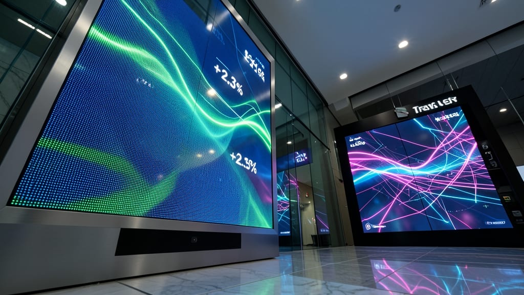
When your financial data needs to leave a lasting impression beyond slides and spreadsheets, interactive LED art installations turn KPIs into immersive experiences. Imagine a trade show booth where revenue growth pulses in real-time across a 16x16 LED matrix, or a corporate lobby where customer acquisition metrics shift colors like a living painting—this is data as art.
Tools like Processing (for digital) or Arduino-powered LED arrays (for physical) let you map metrics to visual elements, from dynamic bar charts to abstract wave patterns. For high-end setups, companies use TouchDesigner to sync data feeds with 3D-projected holograms, creating installations that double as conversation starters. The result? Stakeholders remember the experience—not just the numbers. ✨
Comparative Benchmarking with Icons
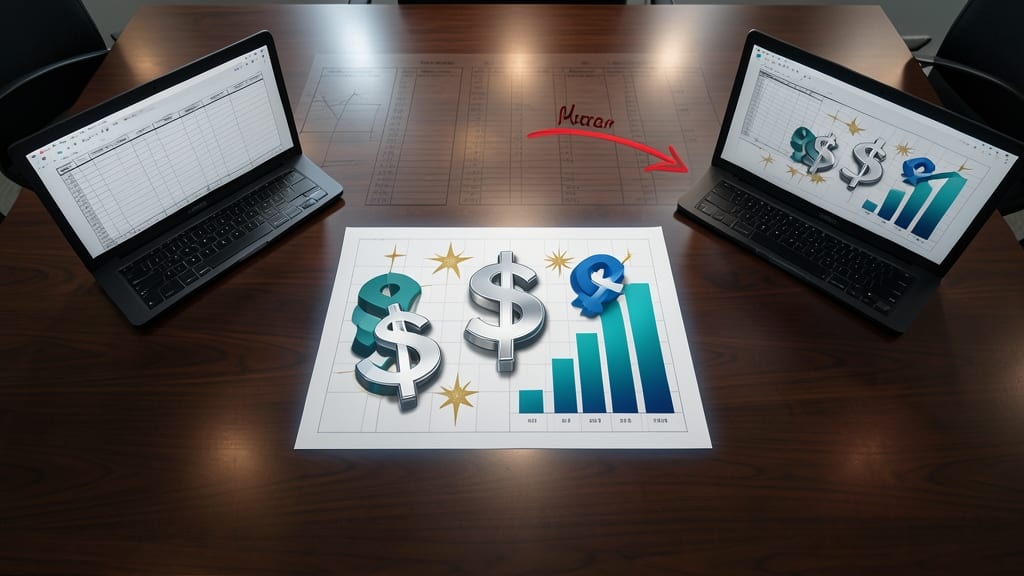
Boardrooms often turn into battles of spreadsheets when comparing competitors—but what if you could replace rows of numbers with scalable icons that speak volumes at a glance?
Tools like Canva’s infographic templates or Flourish’s icon-based charts let you swap dollar signs, stars, or bar graphs for metrics like revenue growth or market share. A $1M increase becomes a stack of three dollar signs, while a 20% lead transforms into a starburst graphic. The result? Instant clarity for audiences who’d rather spot trends than parse decimals.
Perfect for quarterly reviews or investor decks, this approach turns data into a visual language—no design skills required. ✨
Voice-Activated Data Narratives

Tired of staring at slides while your audience nods off? Voice-activated data narratives turn your financial presentations into an interactive experience—no screens required. By integrating smart speakers like Amazon Echo or custom Python scripts, you can deliver real-time insights verbally, keeping remote teams or visually impaired stakeholders fully engaged.
Use AWS Lambda or Node-RED to trigger voice updates when KPIs hit thresholds (e.g., "Revenue grew 12% YoY—highlighting Q3’s 25% spike in SaaS subscriptions"). For hands-free control, pair with Google Assistant or Microsoft Azure Speech to parse natural language queries like "Show me last quarter’s expenses by department." The setup requires minimal coding—just a JSON data feed and a few lines of script to connect to your CRM or ERP.
Perfect for board meetings with hybrid attendees or accessibility-focused teams, this approach turns passive listeners into active participants. 💡
Gamified Financial Challenges
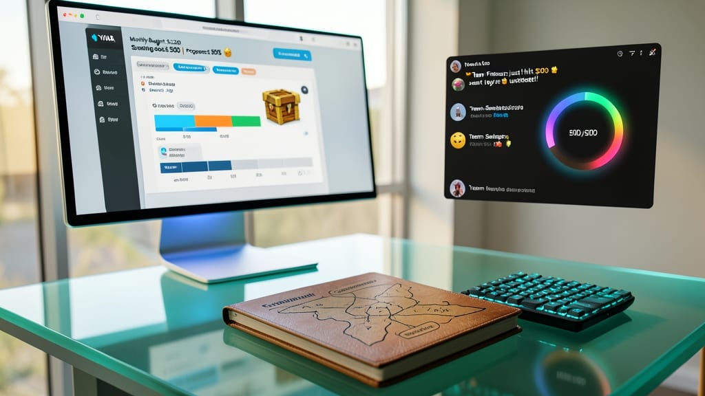
Tired of budgeting spreadsheets collecting digital dust? Gamified financial challenges turn expense tracking into a competitive, engaging experience—think Slack bots that reward teams for hitting savings goals or mobile apps where users "level up" by optimizing spending.
Platforms like YNAB’s "Game Mode" or Finch (a Slack-based expense tracker) use achievements, leaderboards, and real-time feedback to make budgeting feel like a challenge rather than a chore. For example, Finch’s "Budget Boss" feature lets teams compete to reduce unnecessary expenses, with AI-driven insights suggesting smarter spending habits. The result? Higher engagement and real behavioral change—not just passive data review.
This approach works best for remote teams, startups, or financial literacy programs where traditional methods fall flat. Imagine employees actually looking forward to monthly expense reviews—because it’s part of the game. 💪
Holographic Data Projections

When your next investor roadshow needs to leave a lasting impression, holographic data projections turn traditional presentations into sci-fi-worthy experiences. Tools like Microsoft HoloLens 2 or Zebra Motion let you overlay interactive 3D financial models onto physical spaces—think floating revenue projections or rotating cash flow graphs that stakeholders can manipulate with gestures.
The tech works by combining AR/VR hardware with specialized software like Unity or Unreal Engine, where you can import real-time data feeds (e.g., live stock prices or quarterly earnings). A touchless interface lets investors zoom into details, rotate models 360°, or even "walk through" projected financial scenarios—ideal for complex narratives like M&A deals or IPO roadmaps.
Perfect for high-tech startups, private equity firms, or Fortune 500 CFOs pitching to boards that expect cutting-edge tools. Just be ready for the "wow" factor—and maybe a few questions about how you actually predict future growth. ✨